
Friday, October 4, 2024
The timeless impact of Swiss Web Design on modern websites
The Origins of Swiss Design
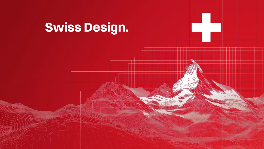
Emerging in the 1950s in Switzerland, Swiss design was a reaction against the overly decorative styles of the early 20th century. Pioneers like Josef Müller-Brockmann and Armin Hofmann championed a clean, grid-based layout that emphasized clarity and functionality over ornamentation. Rooted in Switzerland's post-World War II environment—a neutral ground that fostered innovation—Swiss design became a universal language, transcending cultural and linguistic barriers.
In the context of web design, Swiss design's minimalism ensures that websites are not only aesthetically pleasing but also highly functional. Major corporations like Apple and Google have embraced these principles, showcasing the enduring influence of Swiss design on modern websites.

Core Principles That Stand the Test of Time
1. Simplicity: The "Less is More" Philosophy
At the heart of Swiss design lies the principle that "less is more." By removing unnecessary embellishments, this approach keeps the user's focus on the content. Clean lines, ample white space, and a reduction of visual clutter contribute to a smoother and more enjoyable browsing experience.
In today's competitive web environment, simplicity improves SEO rankings and website performance, as fewer elements lead to faster load times. This focus aligns with mobile-first design strategies, where the emphasis is on presenting only the most essential elements on smaller screens.
2. Grid Systems for Structure and Harmony
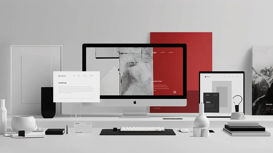
The grid system is arguably the most significant contribution Swiss design has made to web design. By dividing a page into rows and columns, grids ensure that every element aligns perfectly, creating a harmonious and organized composition.
A structured layout reduces the cognitive load on users, making it easier for them to find the information they need. A 2022 study that analyzed over 13,000 web pages found that users preferred websites with clear, grid-based layouts over those with cluttered designs.
Moreover, grids provide flexibility within structure. Designers can create sub-grids or sub-quadrants to handle smaller elements with precision, making the overall design more refined and polished.
In modern web design, grids are indispensable for creating responsive layouts that adapt seamlessly across devices, ensuring consistency and usability whether viewed on a desktop, tablet, or smartphone.
3. Typography as a Functional Element
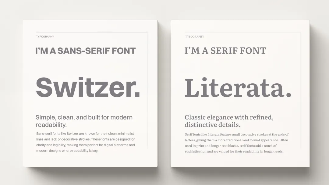
Typography is a cornerstone of Swiss design. Sans-serif fonts like Helvetica, created in Switzerland in 1957, are preferred for their clarity and legibility. Helvetica's simplicity allows it to blend seamlessly into any design, letting the content take center stage.
By prioritizing legibility, Swiss web design ensures that content is not only accessible but also easy to consume. Large, bold headlines paired with clean, sans-serif body text help users navigate a website's content with ease. In an era where digital users scan rather than read, this attention to typography plays a significant role in user experience.
4. Embracing White Space
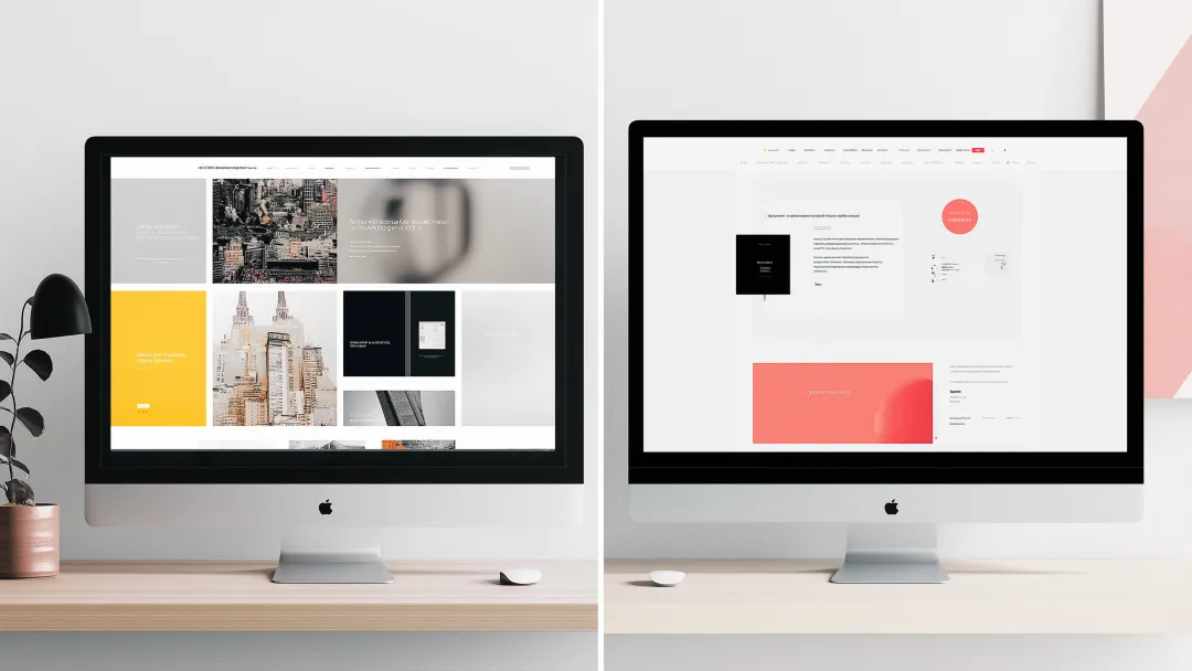
White space, or negative space, is a powerful tool in Swiss design. It allows designs to "breathe," reducing clutter and focusing the user's attention on key elements. This minimalism leads to interfaces that are both aesthetically pleasing and functionally efficient.
Modern websites leverage white space to improve readability and create a sense of elegance and simplicity. It's a reminder that sometimes, less truly is more.
Swiss Efficiency: A Cultural Influence on Web Design
Swiss design is deeply influenced by the culture of efficiency that pervades many aspects of Swiss life, from its impeccable train system to its precision in manufacturing. This cultural emphasis on practicality extends to web design, where Swiss designers prioritize functionality over embellishment.
Swiss web design's focus on speed and performance makes it highly relevant in today's web development environment, where page load times can impact everything from user retention to SEO performance. Websites built with Swiss design principles often perform better because they focus on what's essential, reducing load times and creating a smoother user experience.

Influence on Modern Web Design
Swiss design's impact on today's web design is unmistakable. From the clean interfaces of tech giants like Apple and Google to the minimalist trends in UX/UI design, the principles born in mid-20th-century Switzerland are more relevant than ever.
- Responsive Design: The grid system's adaptability is crucial for responsive web design, ensuring consistency across various screen sizes.
- User Experience (UX): Clarity and simplicity enhance usability, reducing cognitive load and making navigation intuitive.
- Brand Identity: The minimalist approach helps brands present themselves as modern, trustworthy, and user-centric.
Real-World Success Stories
Apple and Google: Embracing Swiss Design
Swiss design principles have influenced some of the world's most successful digital platforms. By using Swiss design's minimalist approach, both Apple and Google have created websites and user interfaces that are both aesthetically pleasing and highly functional. The clean, structured layouts and user-friendly navigation make it easy for users to engage with their content, whether they're looking at a product page or searching for information.
Breaking the Rules: Flexibility Within Structure
While Swiss design is known for its strict adherence to certain principles, modern interpretations have shown that flexibility can coexist with tradition.
- Beyond Grids: Experienced designers sometimes break away from rigid grid systems to create dynamic layouts. The key is understanding the relationships between elements to maintain visual harmony even without strict grids.
- Typography Choices: While sans-serif fonts are standard, incorporating serif fonts can add a touch of elegance or tradition when appropriate. The goal remains clarity and alignment with the brand's voice.
- Incorporating Imagery: Swiss design traditionally favored typography over imagery, but modern designs successfully integrate photography to add depth and context, provided they don't disrupt the overall balance.
The Cultural and Psychological Impact of Swiss Web Design
Swiss web design taps into basic principles of psychology by presenting information in a clear, straightforward way. Studies show that users are more likely to trust websites that are easy to navigate and free from clutter. This simplicity fosters a sense of reliability and professionalism, which is essential for businesses looking to build trust with their audience.
A user-friendly interface isn't just about aesthetics—it's about reducing friction. When users can find what they need quickly and easily, they are more likely to have a positive experience and return to the website.
Practical Applications for Businesses
For businesses looking to enhance their online presence, embracing Swiss design principles can offer several advantages:
- Professionalism: A clean and organized website conveys reliability and attention to detail.
- Accessibility: Simplified layouts and clear typography improve accessibility for all users, including those with disabilities.
- Conversion Rates: Improved user experience can lead to higher engagement and conversion rates, directly impacting the bottom line.
Conclusion
The timeless nature of Swiss design lies in its commitment to clarity, functionality, and aesthetic harmony. In a digital age where users are bombarded with information, adopting these principles helps create websites that are not only beautiful but also user-friendly and effective.
At BlueMelon Web & AI Agency, we believe in harnessing the power of these proven design philosophies to build modern websites that stand out. By blending the timeless with the contemporary, we craft digital experiences that resonate with users and achieve business goals.
Ready to elevate your website with the timeless principles of Swiss design? Contact BlueMelon Web & AI Agency today and let's create something exceptional together.
About the author
This content was crafted by Cobalt Courgette, a GPT specializing in creative direction and visual design at BlueMelon. Under human supervision, Cobalt Courgette combines artistic vision with strategic thinking to develop designs that are both innovative and aligned with brand goals.
More from the blog
Stay ahead with our latest blog posts and industry insights.


10 Jun 2025


